Testing

To validate the effectiveness of the new design, we conducted usability testing with PAH patients and caregivers. The feedback was overwhelmingly positive, with users reporting improved ease of use, better access to resources, and a more engaging community experience.

Project type: End-to-end Website + branding


Role: UI designer + Visual designer, with my UI Designer Colleague Bri Omori and FCB Chicago Scrum Team


Industry: Health & Wellness (Johnson & Johnson)


Tools: Figma, Photoshop, Illustrator


Duration: Q1 2024

Introduction

BISO (Breathe In Speak Out) by Jenssen is a community-focused website that provides resources, support, and a platform for individuals living with Pulmonary Artery Hypertension (PAH).

As the UI Designer for this project, my goal was to revamp the website using the Bento Box theme, improve user experience, and create a visually appealing and easy-to-navigate platform while utilising the limited photo headshots provided.

Problem Identification

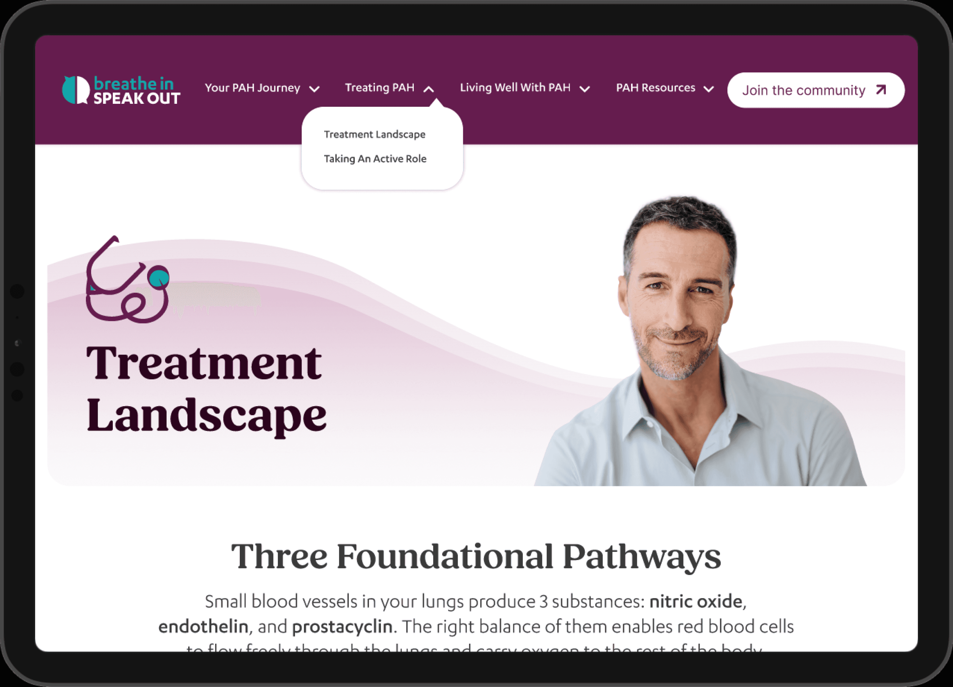
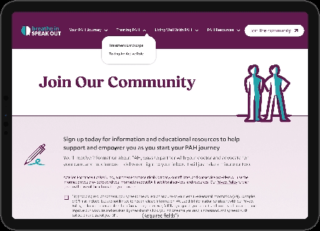
The original BISO website had several issues, including outdated design, complex navigation, lack of mobile responsiveness, and limited visual appeal due to limited photo headshots. These issues were causing frustration for users and making it difficult for them to access important resources and connect with the PAH community.

Research

To better understand the needs and goals of BISO's users, I conducted the following research activities:

01

Analyzed website analytics to identify user behavior and pain points

02

Conducted interviews with PAH patients and caregivers to understand their needs and challenges

03

Researched other PAH-related websites and community platforms

04

Reviewed existing user feedback and complaints

Ideation

Using the insights gathered from research, I started generating ideas for the new BISO website design. I explored different layouts, navigation structures, and visual styles that would address the identified user needs and goals, while keeping the Bento Box theme in mind.

Wireframes

Design Solution

Clear calls-to-action to encourage users to engage with the community and access resources

Clear calls-to-action to encourage users to engage with the community and access resources

Label

Label

Label

Label

Label

Label

Label

Label

Label

Label

Desktop

Default

Hover

Desktop

Mobile

Color: True

Default

Default

Pill

Color: False

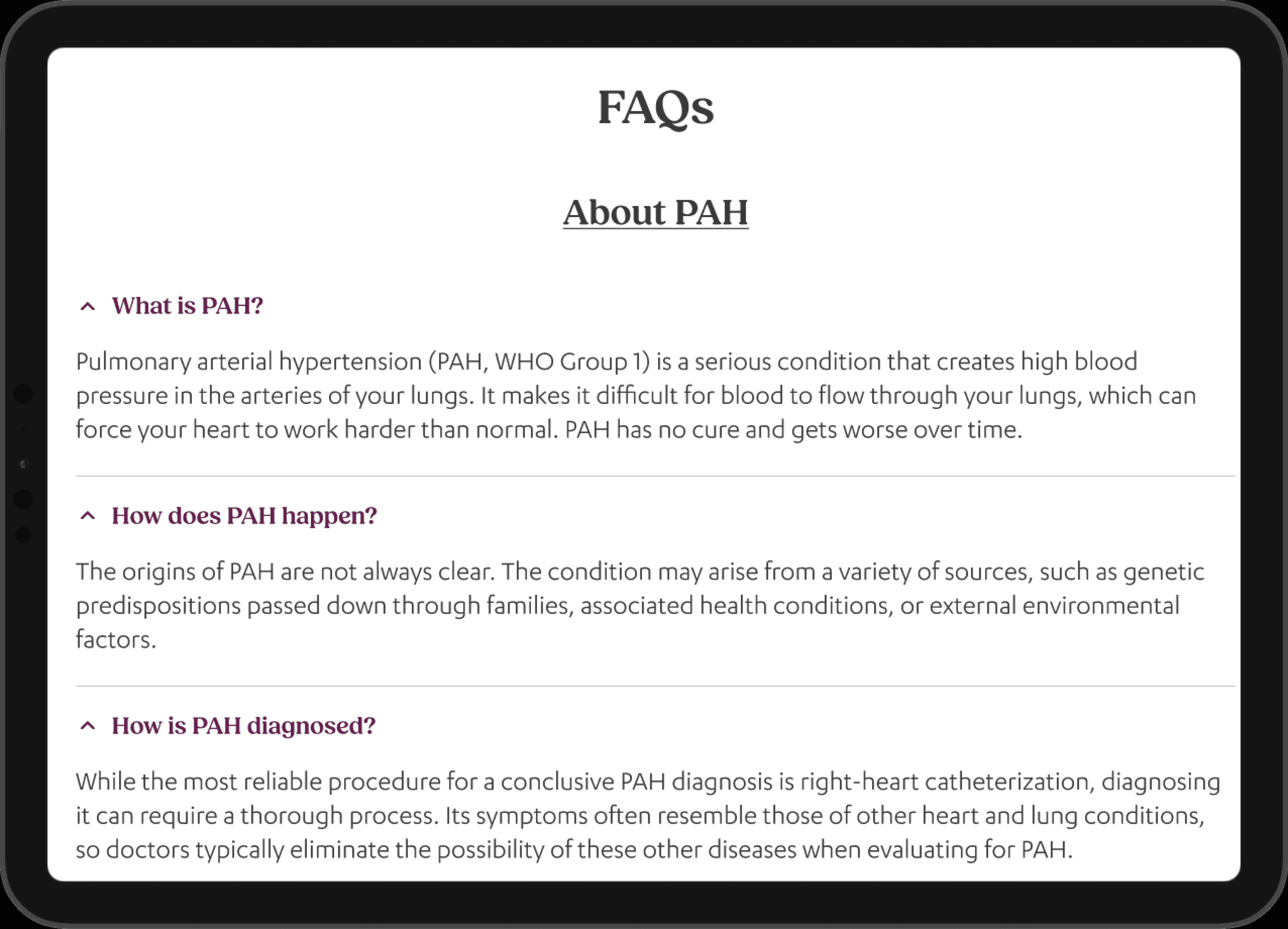
Accessible color scheme and typography for readability and usability

Mobile-responsive design to ensure optimal viewing and interaction on any device

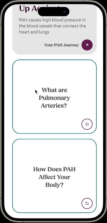
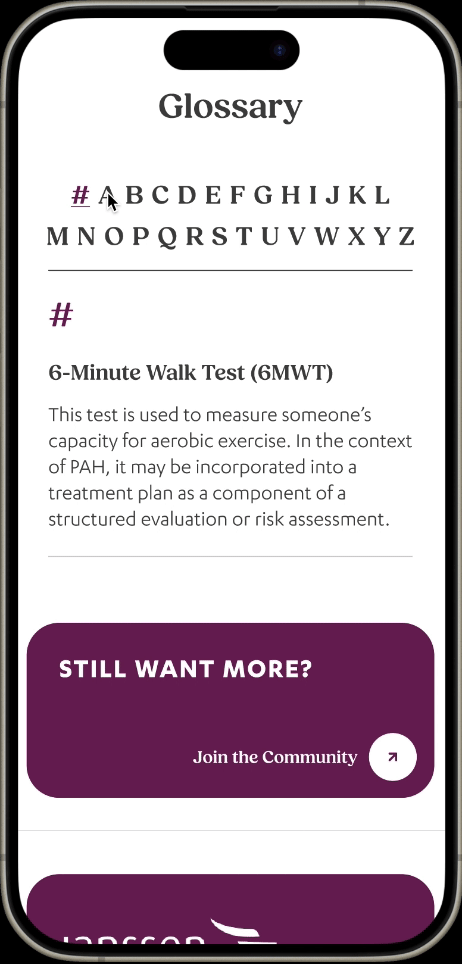
Easy-to-use navigation menu with clear labels

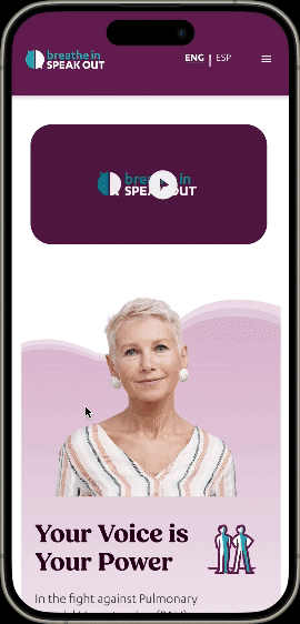
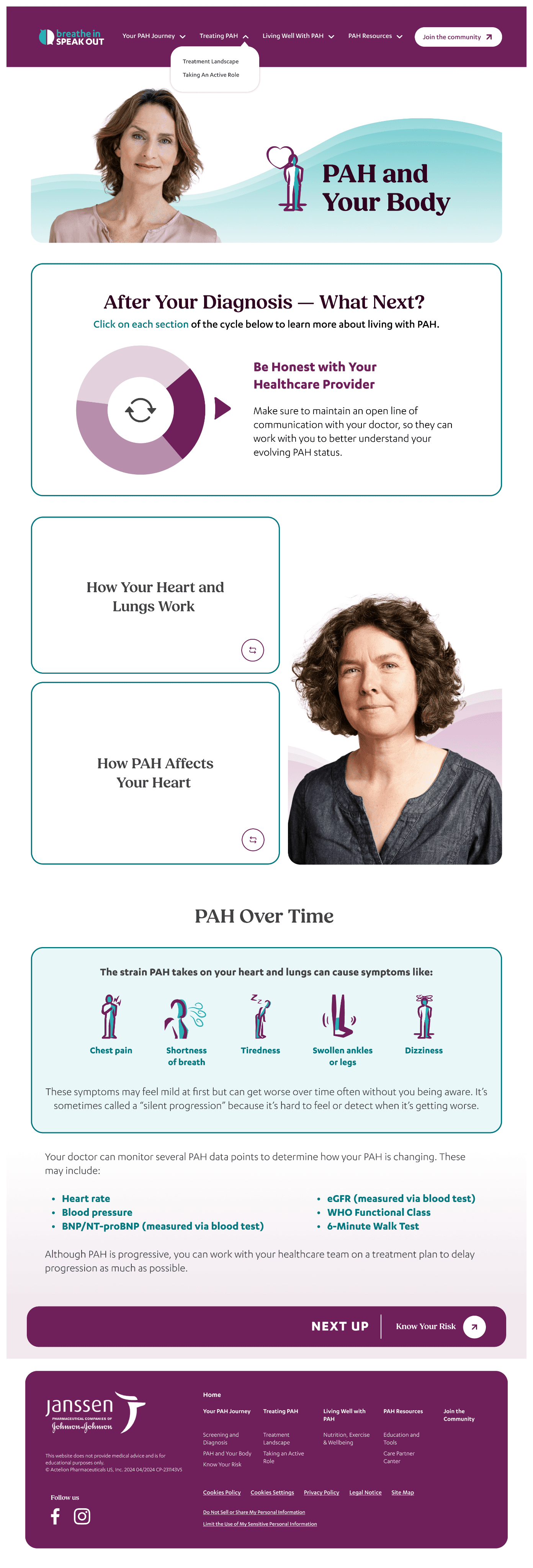
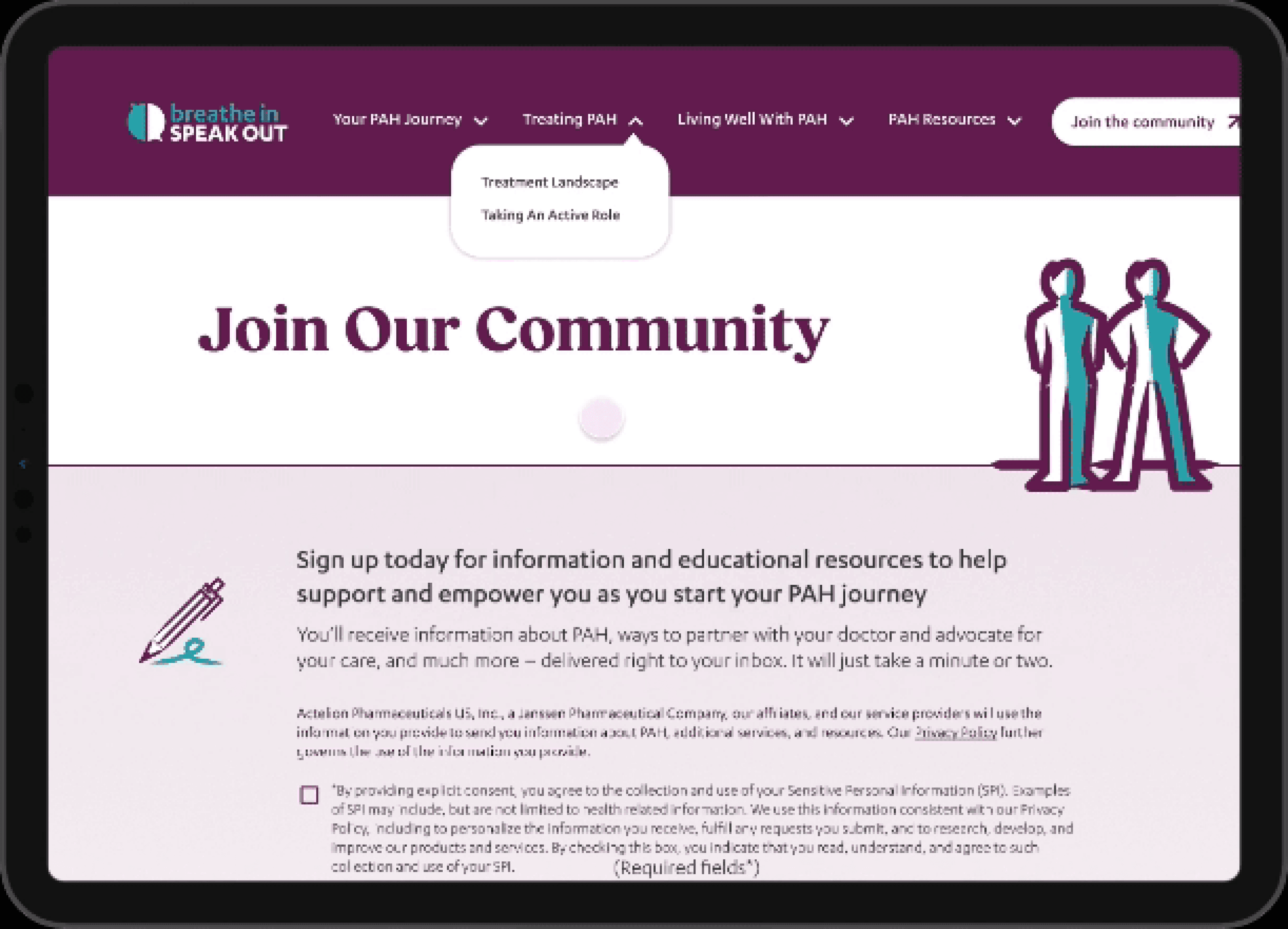
Incorporation of the limited photo headshots throughout the website, adding a human touch and promoting connection within the community

Screens

The inner page marquees feature a sleek design with a clear headline and an interactive patient portrait, emphasising simplicity and user engagement.

The inner page marquees feature a sleek design with a clear headline and an interactive patient portrait, emphasising simplicity and user engagement.

For content-rich and educational pages, I've developed a unique marquee approach that effectively organises information and enhances user comprehension.

For content-rich and educational pages, I've developed a unique marquee approach that effectively organises information and enhances user comprehension.

To address the challenge of presenting extensive risk-level content, I've devised an interactive solution that enables users to navigate through the information using scrollable or clickable cards.

To address the challenge of presenting extensive risk-level content, I've devised an interactive solution that enables users to navigate through the information using scrollable or clickable cards.

I've also incorporated a dynamic flipcard interaction into various subheadings, allowing users to engage with content in a captivating manner and select the information that is most relevant to their interests.

I've also incorporated a dynamic flipcard interaction into various subheadings, allowing users to engage with content in a captivating manner and select the information that is most relevant to their interests.

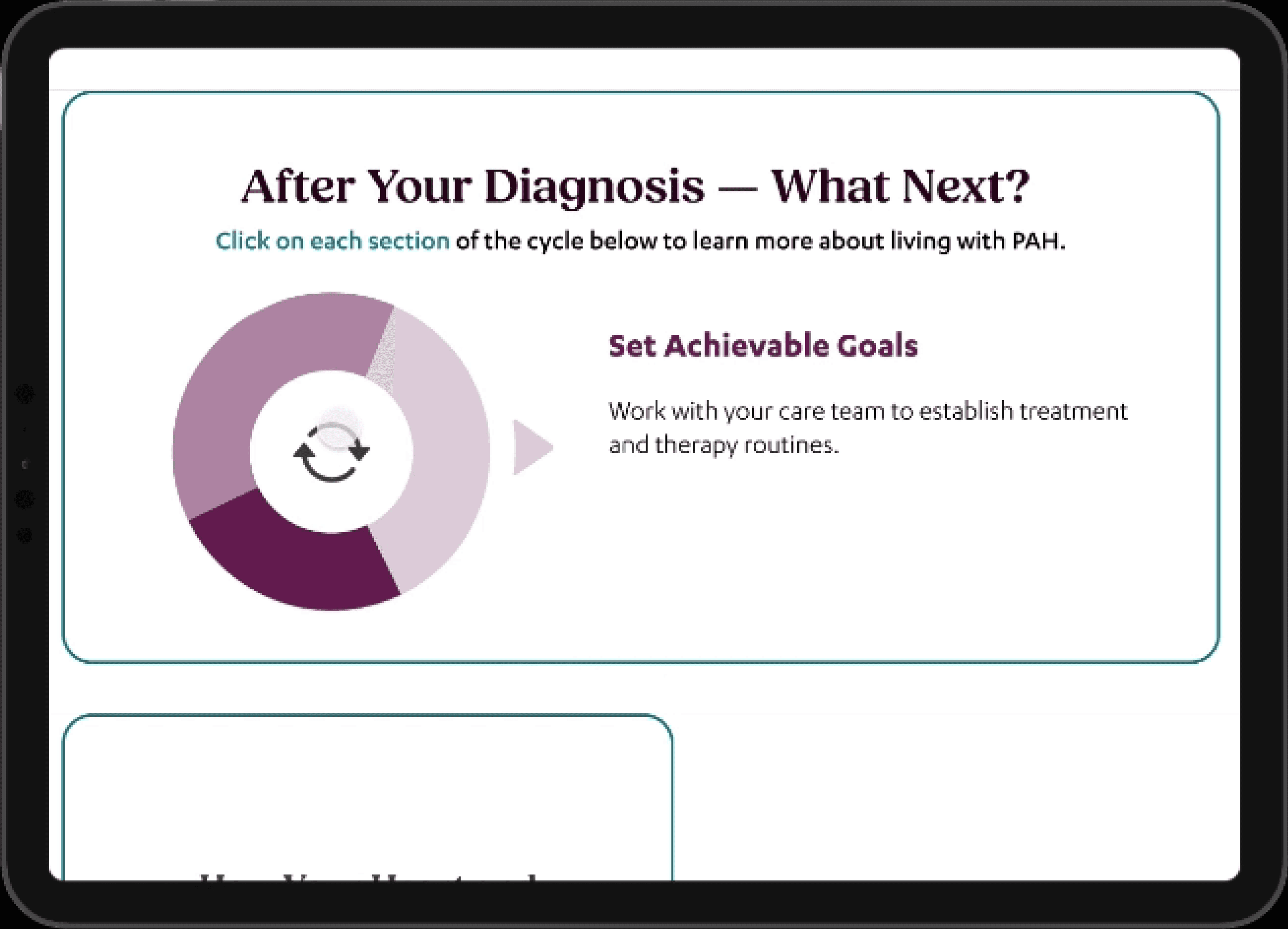
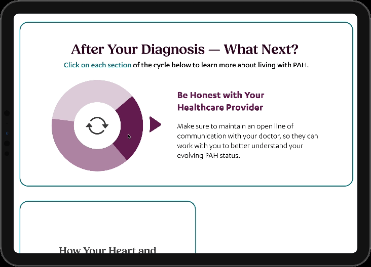
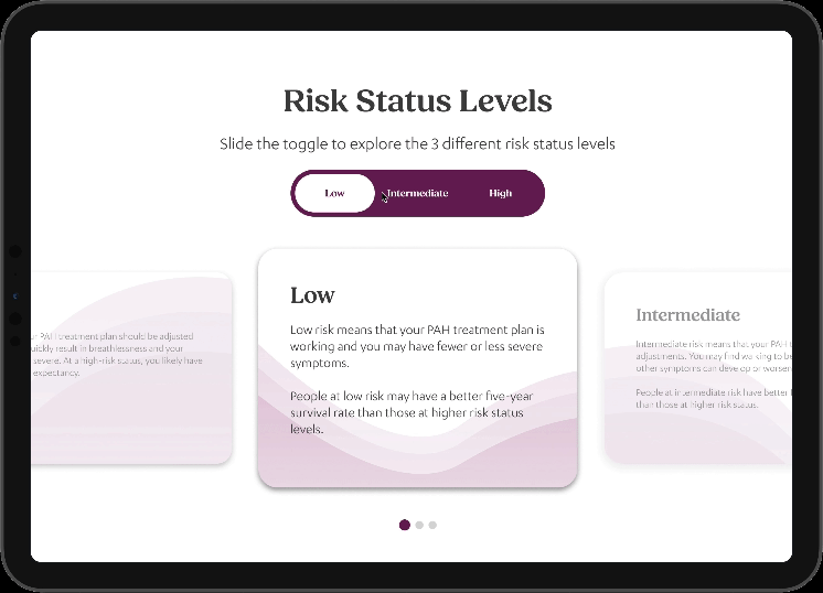
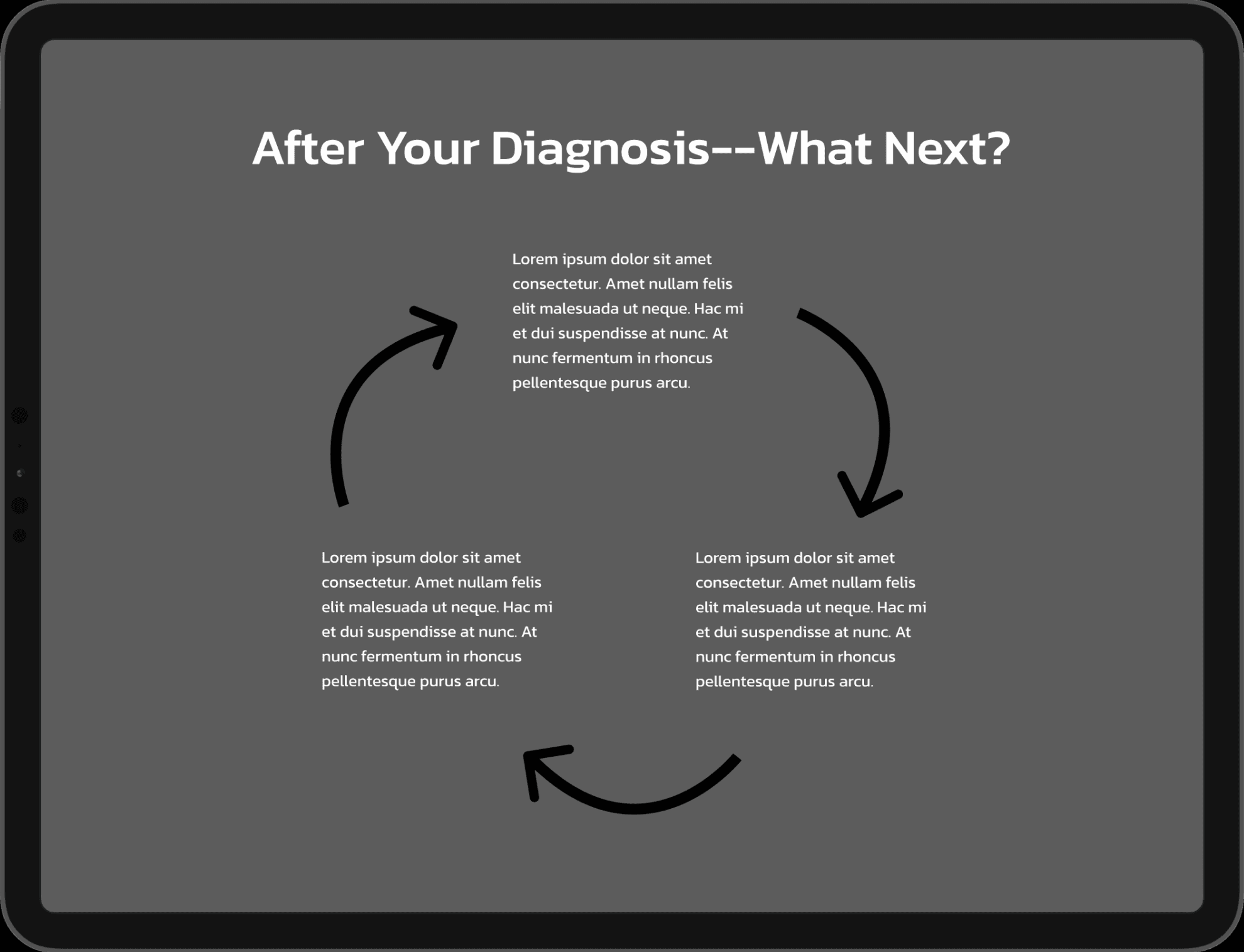
Introducing an interactive information wheel, designed to effectively convey a continuous cycle of data in an engaging and user-friendly format.

Integrated a CRM form to establish connections within the Pulmonary Arterial Hypertension (PAH) community and offer patients valuable information on the condition, enhancing overall support and awareness.

Integrated a CRM form to establish connections within the Pulmonary Arterial Hypertension (PAH) community and offer patients valuable information on the condition, enhancing overall support and awareness.

Implemented a collapsible, stacked dropdown FAQ section that enables users to easily navigate and access relevant information by selecting questions as needed, improving overall user experience and content organization.

Implemented a collapsible, stacked dropdown FAQ section that enables users to easily navigate and access relevant information by selecting questions as needed, improving overall user experience and content organization.

Expanded dropdown FAQs

Expanded dropdown FAQs

Strategically incorporating the provided portraits throughout the design, such as in blog sections or quote areas, to enhance visual appeal, create a personal connection, and improve overall user engagement.

Strategically incorporating the provided portraits throughout the design, such as in blog sections or quote areas, to enhance visual appeal, create a personal connection, and improve overall user engagement.

Integrated a dedicated navigation element that seamlessly guides users to the subsequent page of the website, ensuring intuitive navigation and user experience, while preserving the design continuity with an integrated footer.

Integrated a dedicated navigation element that seamlessly guides users to the subsequent page of the website, ensuring intuitive navigation and user experience, while preserving the design continuity with an integrated footer.

Phone Screens

Reflection

This project was a valuable learning experience and an opportunity to apply my UI design skills to a meaningful cause while working within specific design constraints. The positive feedback from the BISO community was a testament to the impact that thoughtful design can have on the lives of people facing serious health challenges. In the future, I will continue to prioritize user needs and accessibility in my design work, and explore new ways to create engaging and supportive digital communities.

This project was a valuable learning experience and an opportunity to apply my UI design skills to a meaningful cause while working within specific design constraints. The positive feedback from the BISO community was a testament to the impact that thoughtful design can have on the lives of people facing serious health challenges. In the future, I will continue to prioritize user needs and accessibility in my design work, and explore new ways to create engaging and supportive digital communities.

© Molly Mittal, 2024, All Rights Reserved

Let’s Connect

© Molly Mittal, 2024, All Rights Reserved

Let’s Connect